John Sutherland, over at crofteleven (locally based in Roy Bridge…or soon to be local!) has been doodling up a logo for doughies (as per this post here).
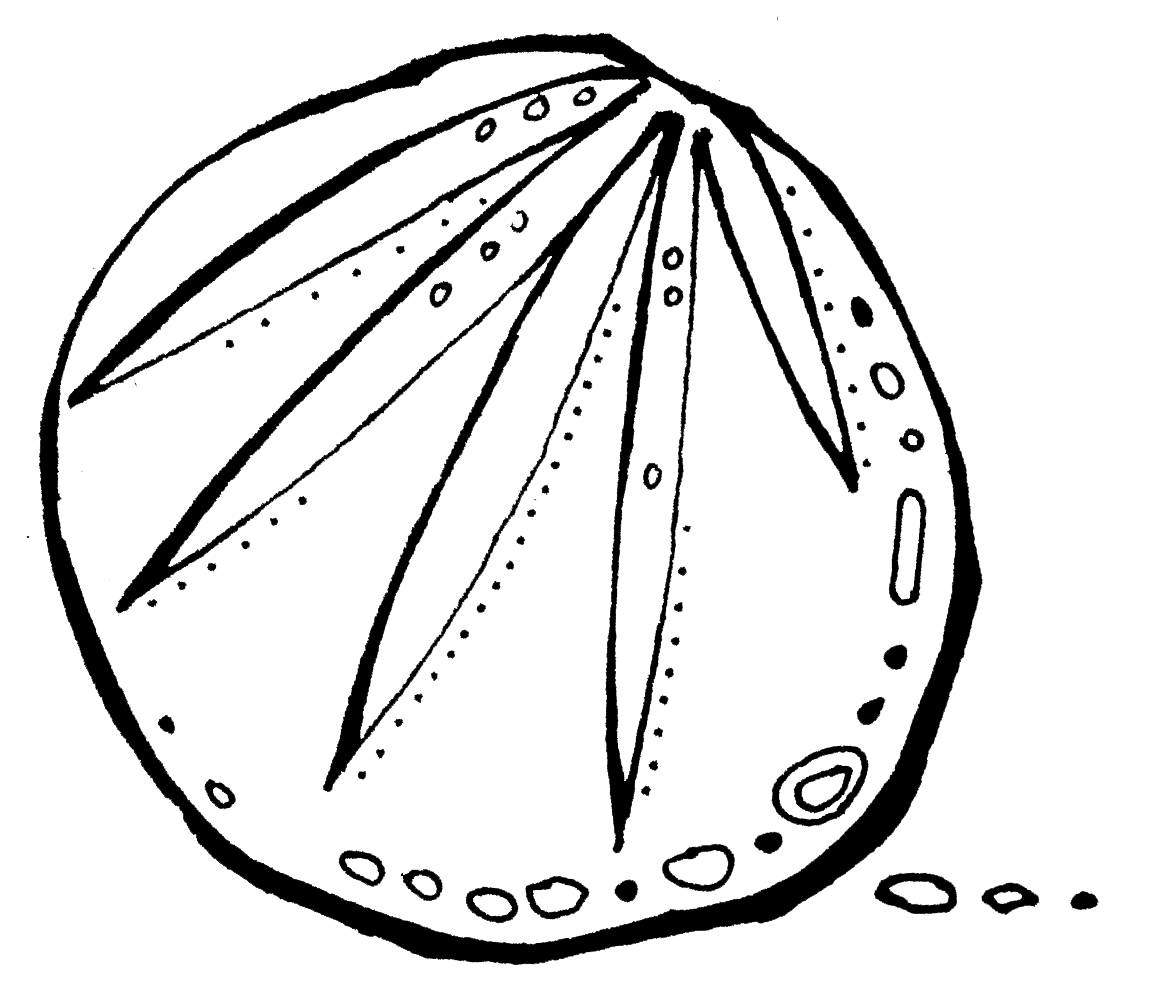
Below are a few initial ideas hot off the press. 2 are based on a fan slashed boule of bread, the other the infamous baker boy deli bike. We thought we’d share on the blog so we can get community opinion? We like the top one best with the boule embedded as an “o” and John is putting this in the proofing cabinet and developing further – but what do you think?


yep top one for me
Good choice D; glad to see you’ve found the doughies comment stream – keep the coming!
I concur with the top choice! How about making the boule a little more realistic and stand out a little more (shading/wider outline?)? Could lots of different boules be used in a multitude of different versions of the logo or is it important that the logo is always identical for brand identity? And how would the logo look with more boules for other letters – too crowded perhaps? Looking forward to seeing the reults of some more ‘doodling’.
Greeat post thank you